


The Majić winery from Ljubuški is relatively new and unknown in Herzegovina. Nevertheless, a long-standing family tradition and rich business experience abroad are embedded in the foundations of this modern family vineyard and winery. After initial investment, this is the first time that the client has gone to the market with their own wines. At the very start, the range of wines is already quite broad; there are white wines - žilavka, pošip, chardonnay, then rosé wine, and red wines - blatina, cabernet sauvignon, trnjak and cuvee.
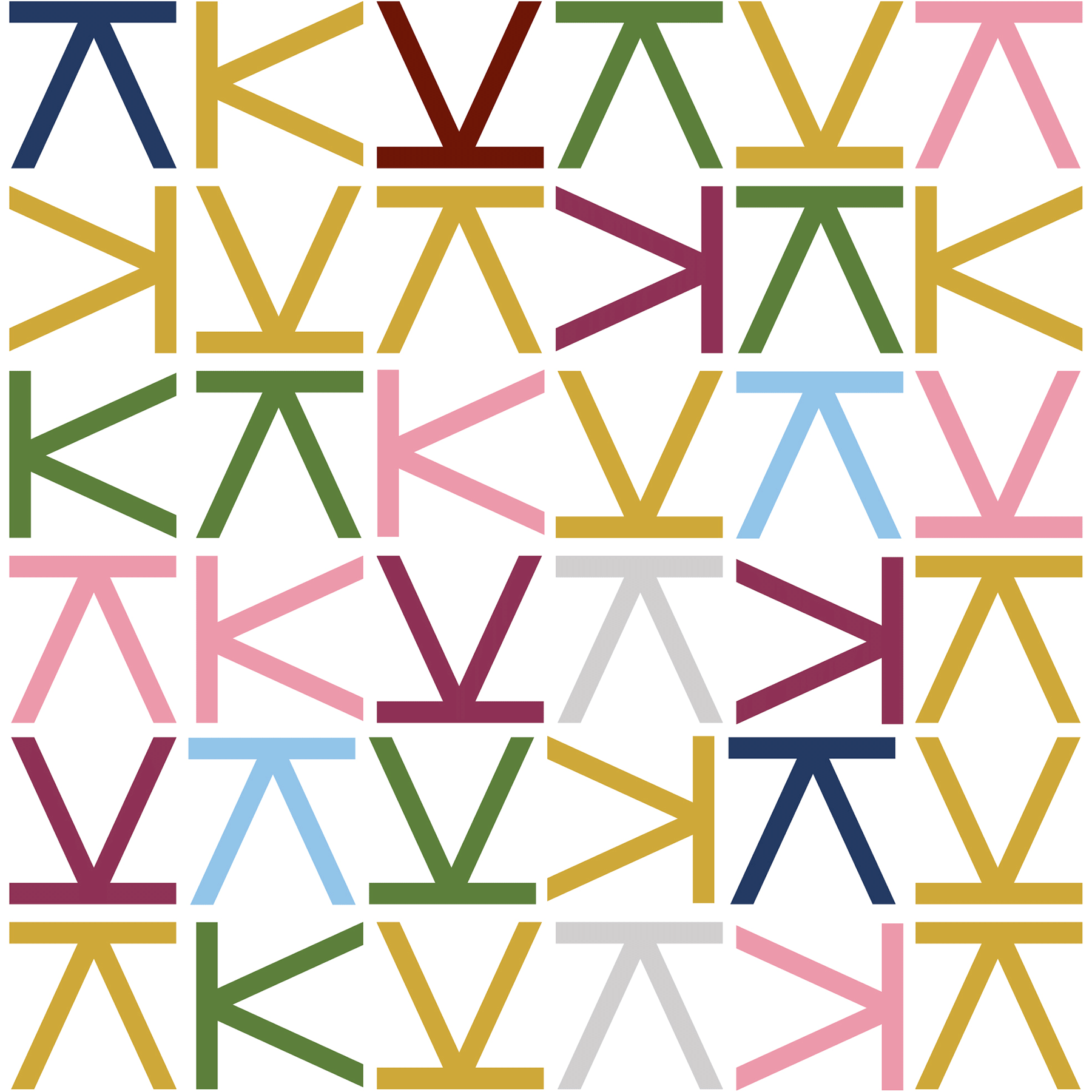
Despite the existing logo of the winery, which the client did not want to change, we focused on the development of the entire new wine collection, giving it its own recognizable elements. They are primarily based on the letter K, which is directly linked to their poignant family story. Each wine adopted its own combination of colours within the newly composed K-raster, with the fact that two wines — Two Sisters Cuvee and Kate Rosé have a slightly more special "treatment" that slightly stands out from the concept. The final result is an original, modern and at the same time minimalist concept that will easily ensure its recognition.

The graphic concept, which we created using the letter K within a square form, is easy to apply and communicate through both traditional and digital channels. In addition, it is useful for creating various promotional materials. For the client, we also designed a wine list for well-known restaurants, hotels and bars, as well as transport packaging and elements of marketing promotion which are necessary for participation and presentation at various wine fairs and events.


