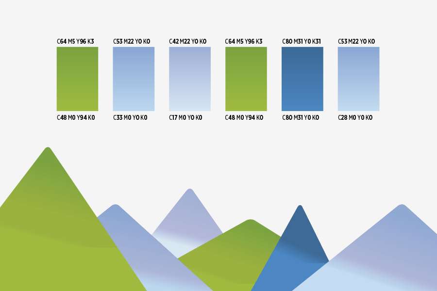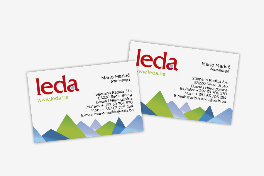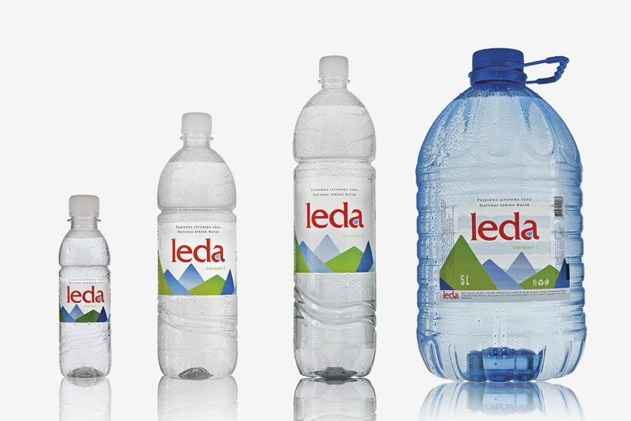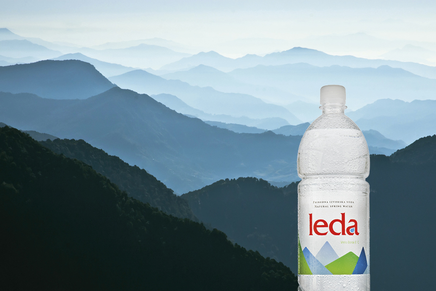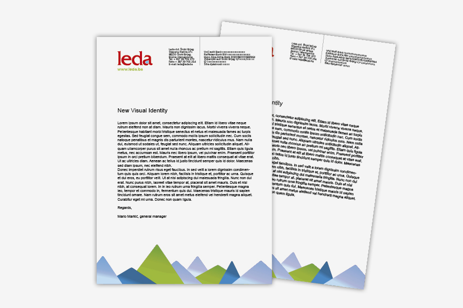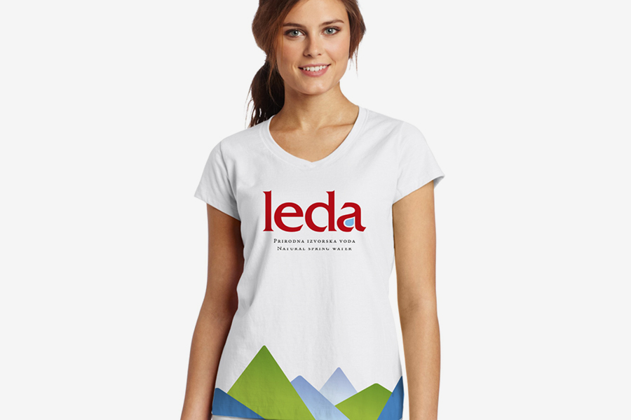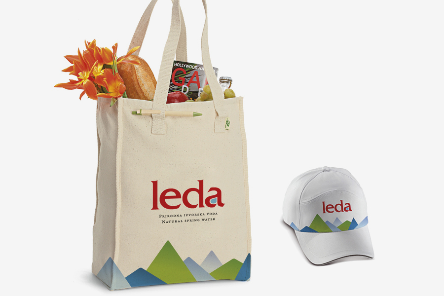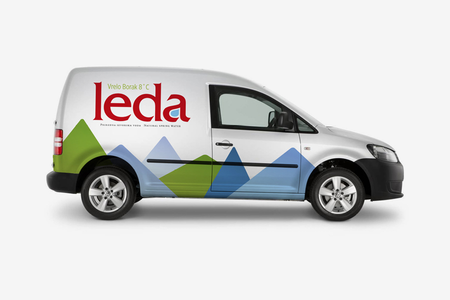


The freshwater spring sourced from the Lištica river, i.e. Vrelo Borak, is the place from which our client draws an exceptional gift from nature - Leda water. The company decided to redesign the packaging at the beginning of this year. Our client set us the task of giving their product a more modern and vibrant appearance in order to achieve a long-term increase in daily consumption and to gain a wider audience. Together, we defined the basic features that the new design should present - primarily freshness and the purity of the bottling process. Special attention was paid to the modern appearance of the brand. The challenge and mission of our agency was to fulfil the promise given by the brand through authentic positioning which should, along with the suitable design, convey the feeling of freshness and purity. The new packaging needed to differentiate our client from the ever increasing competitors and make a strong impression when seen on store shelves. By establishing a strong communication hierarchy, Leda has gained a more powerful and dominant market approach. The new packaging highlights the essence of the product - natural spring water. The use of vivid colour and distinctive lettering has made the brand easily recognizable. The new packaging evokes a feeling of freshness in the customers and reminds them of the beautiful mountain scenery within which the spring is hidden. By redesigning the packaging, the core message of the brand was highlighted - the naturalness and purity of the bottling process. We adjusted the design to six different sizes of packaging.
The freshwater spring sourced from the Lištica river, i.e. Vrelo Borak, is the place from which our client draws an exceptional gift from nature - Leda water. The company decided to redesign the packaging at the beginning of this year. Our client set us the task of giving their product a more modern and vibrant appearance in order to achieve a long-term increase in daily consumption and to gain a wider audience. Together, we defined the basic features that the new design should present - primarily freshness and the purity of the bottling process. Special attention was paid to the modern appearance of the brand. The challenge and mission of our agency was to fulfil the promise given by the brand through authentic positioning which should, along with the suitable design, convey the feeling of freshness and purity. The new packaging needed to differentiate our client from the ever increasing competitors and make a strong impression when seen on store shelves. By establishing a strong communication hierarchy, Leda has gained a more powerful and dominant market approach. The new packaging highlights the essence of the product - natural spring water. The use of vivid colour and distinctive lettering has made the brand easily recognizable. The new packaging evokes a feeling of freshness in the customers and reminds them of the beautiful mountain scenery within which the spring is hidden. By redesigning the packaging, the core message of the brand was highlighted - the naturalness and purity of the bottling process. We adjusted the design to six different sizes of packaging.
