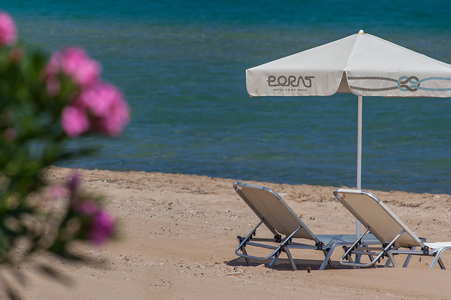


Shift was engaged in creating the new visual identity of family-run Hotel 'Porat,' situated in Neum, B&H. Our client undertook a process of significant investment and upgrading of the of the hotel accommodation in order to meet increasing guest demand. Within the project of the hotel reconstruction, the client also decided to do a complete rebranding. The new visual identity needed to convey the basic values of the hotel. There was a request for us to create a direct link with the name of the hotel (Porat) while also avoiding all clichés associated with sea and seamanship. When starting to work on the hotel’s visual identity design project, we decided to do it in the hard way. We developed an original typeface derived from the contour of the rope of a ship, which is used to tie ships to the dock in the harbor (porat). Besides the manuscript letters, we have also included numbers and other symbols which we used in the development of the graphic standard manual, with the emphasis on both external and internal signage, but also on digital media and social networks. The colour that was used in the identity design is a warm grey hue which tends to brown. This colour was planned for use in the details of the hotel’s architectural project because it is neutral, relaxing and easy to apply in various contexts. The secondary accompanying colour that is also found in the details is a light blue hue, which is colour of the sea and sky, a colour which looks great in combination with the warm gray hue. In this way we created guidelines for the consistent use of the visual identity in all promotional materials that contribute to the modern and sophisticated look of the hotel.
Shift was engaged in creating the new visual identity of family-run Hotel 'Porat,' situated in Neum, B&H. Our client undertook a process of significant investment and upgrading of the of the hotel accommodation in order to meet increasing guest demand. Within the project of the hotel reconstruction, the client also decided to do a complete rebranding. The new visual identity needed to convey the basic values of the hotel. There was a request for us to create a direct link with the name of the hotel (Porat) while also avoiding all clichés associated with sea and seamanship. When starting to work on the hotel’s visual identity design project, we decided to do it in the hard way. We developed an original typeface derived from the contour of the rope of a ship, which is used to tie ships to the dock in the harbor (porat). Besides the manuscript letters, we have also included numbers and other symbols which we used in the development of the graphic standard manual, with the emphasis on both external and internal signage, but also on digital media and social networks. The colour that was used in the identity design is a warm grey hue which tends to brown. This colour was planned for use in the details of the hotel’s architectural project because it is neutral, relaxing and easy to apply in various contexts. The secondary accompanying colour that is also found in the details is a light blue hue, which is colour of the sea and sky, a colour which looks great in combination with the warm gray hue. In this way we created guidelines for the consistent use of the visual identity in all promotional materials that contribute to the modern and sophisticated look of the hotel....


