


Povezani sadržaji:
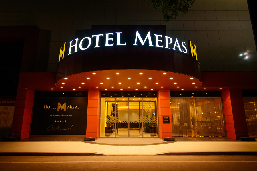
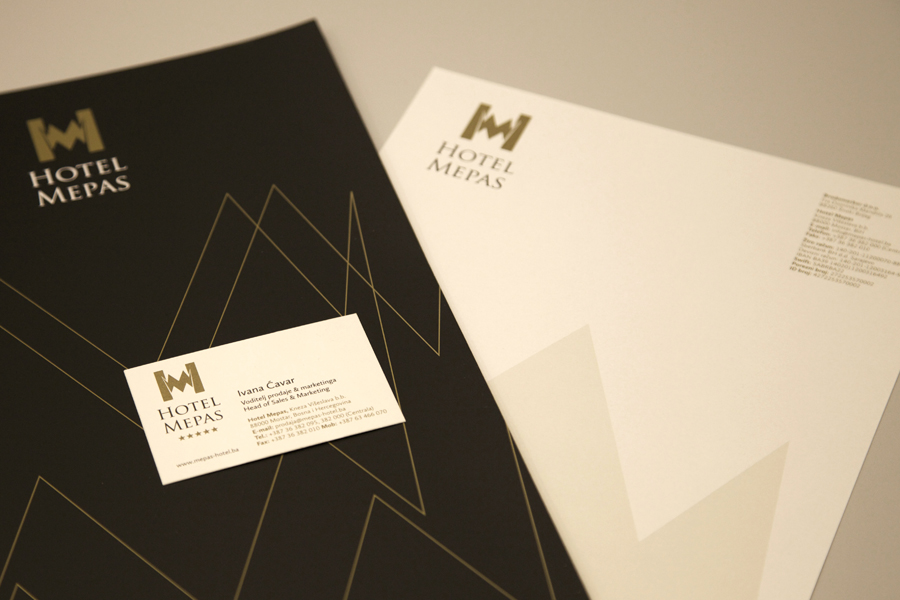
Hotel Mepas in Mostar is the first 5-star hotel in the region. The Shift team worked closely with Hotel Mepas on the implementation of the visual identity to be in harmony with the hotel’s position. With input from the hotel team, SBD designed the signage, in-room materials, promotional materials and the hotel website to bring the message and feel of the hotel across all points of contact. Our task was to upgrade the brand to a higher level of communication, which would provide guests with a sense of premium comfort and luxury. It was a major challenge to create a unique and distinct entity, but still maintain a visual link with the investor (Mepas Group). We incorporated the visual identity elements into an elegant and contemporary brand experience which is well-crafted and authentic. The custom typeface used in this project was Calluna Sans: its linear geometry coupled with a clear and warm environment was chosen for its elegance and its ability to work across different touchpoints. Each touchpoint is an opportunity to strengthen and communicate the essence of a brand. A simple typeface was required to balance the intricate patterns, yet at the same time it had to have enough character to work by itself as a beautiful type piece on numerous print and digital applications. With the brand standards manual Shift created an adaptable graphic system that unified the hotel's marketing and communication materials and helped to position Hotel Mepas as the leading hotel in the region. Signage was a major part of this project; on the one side expressing the brand, while at the same time it building on an understanding of the needs and habits of users in the environment.
Hotel Mepas in Mostar is the first 5-star hotel in the region. The Shift team worked closely with Hotel Mepas on the implementation of the visual identity to be in harmony with the hotel’s position. With input from the hotel team, SBD designed the signage, in-room materials, promotional materials and the hotel website to bring the message and feel of the hotel across all points of contact. Our task was to upgrade the brand to a higher level of communication, which would provide guests with a sense of premium comfort and luxury. It was a major challenge to create a unique and distinct entity, but still maintain a visual link with the investor (Mepas Group). We incorporated the visual identity elements into an elegant and contemporary brand experience which is well-crafted and authentic. The custom typeface used in this project was Calluna Sans: its linear geometry coupled with a clear and warm environment was chosen for its elegance and its ability to work across different touchpoints. Each touchpoint is an opportunity to strengthen and communicate the essence of a brand. A simple typeface was required to balance the intricate patterns, yet at the same time it had to have enough character to work by itself as a beautiful type piece on numerous print and digital applications. With the brand standards manual Shift created an adaptable graphic system that unified the hotel's marketing and communication materials and helped to position Hotel Mepas as the leading hotel in the region. Signage was a major part of this project; on the one side expressing the brand, while at the same time it building on an understanding of the needs and habits of users in the environment.


